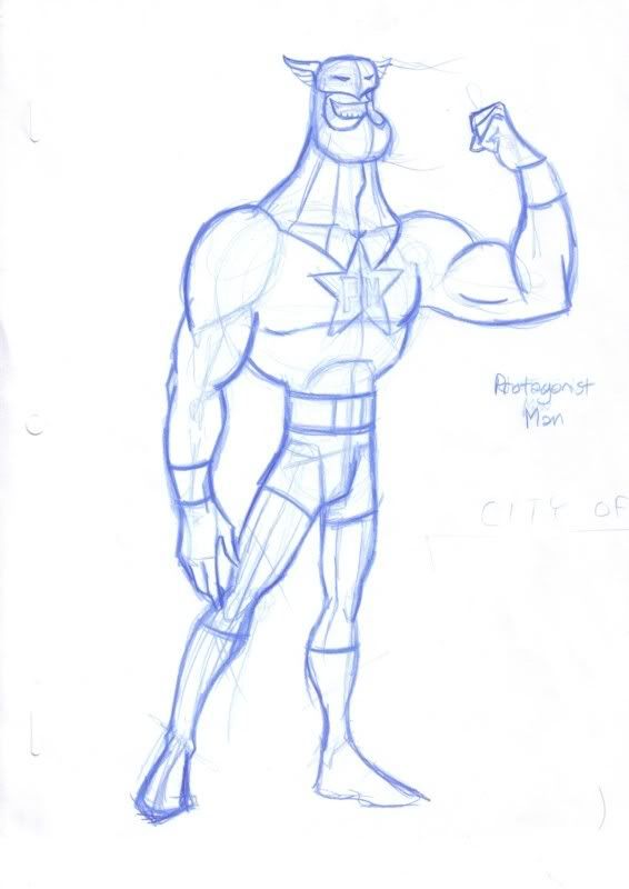
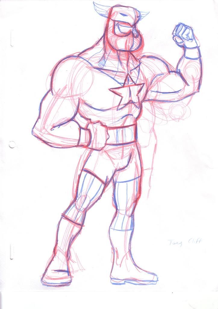
I ran my design pack roughs by John Delaney, excellent use of my time in layout design class, and received the following criticism on the original design of Protag. Basically the character was caught between two styles, naturalism (the upper torso and arms) and stylisation (the legs and neck), and if I want to make the design stronger I had to choose one direction to go in. So...
Here's what he used to look like...
And here's the re-design...


1 comment:
I like the new one a lot more, nice work Dan.
Post a Comment